
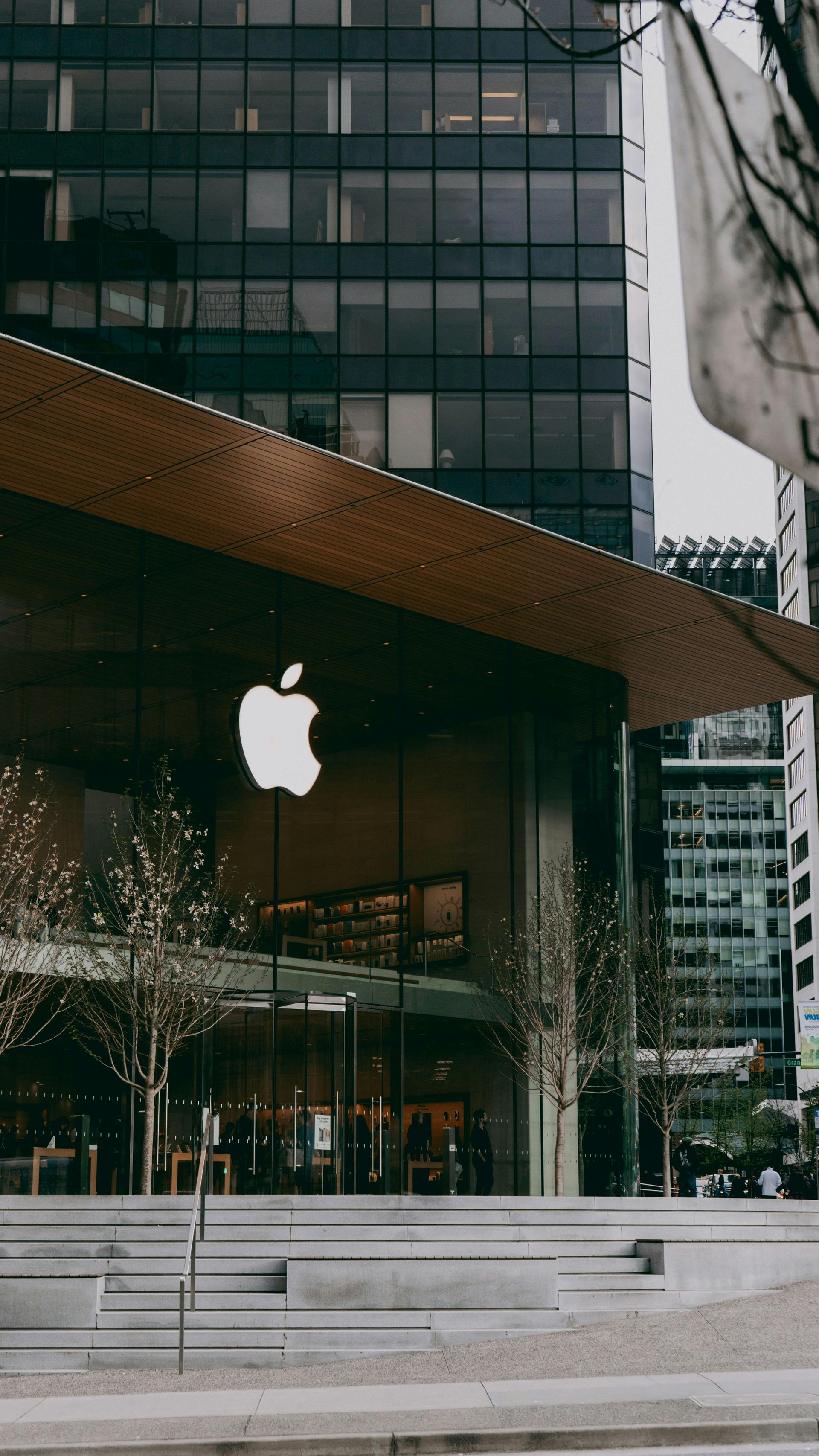
Apple turns 50 and I can't help but get personal. From a fried laptop at Miami Dade College to 5 years on the Apple Store floor, here's how one brand shaped everything.
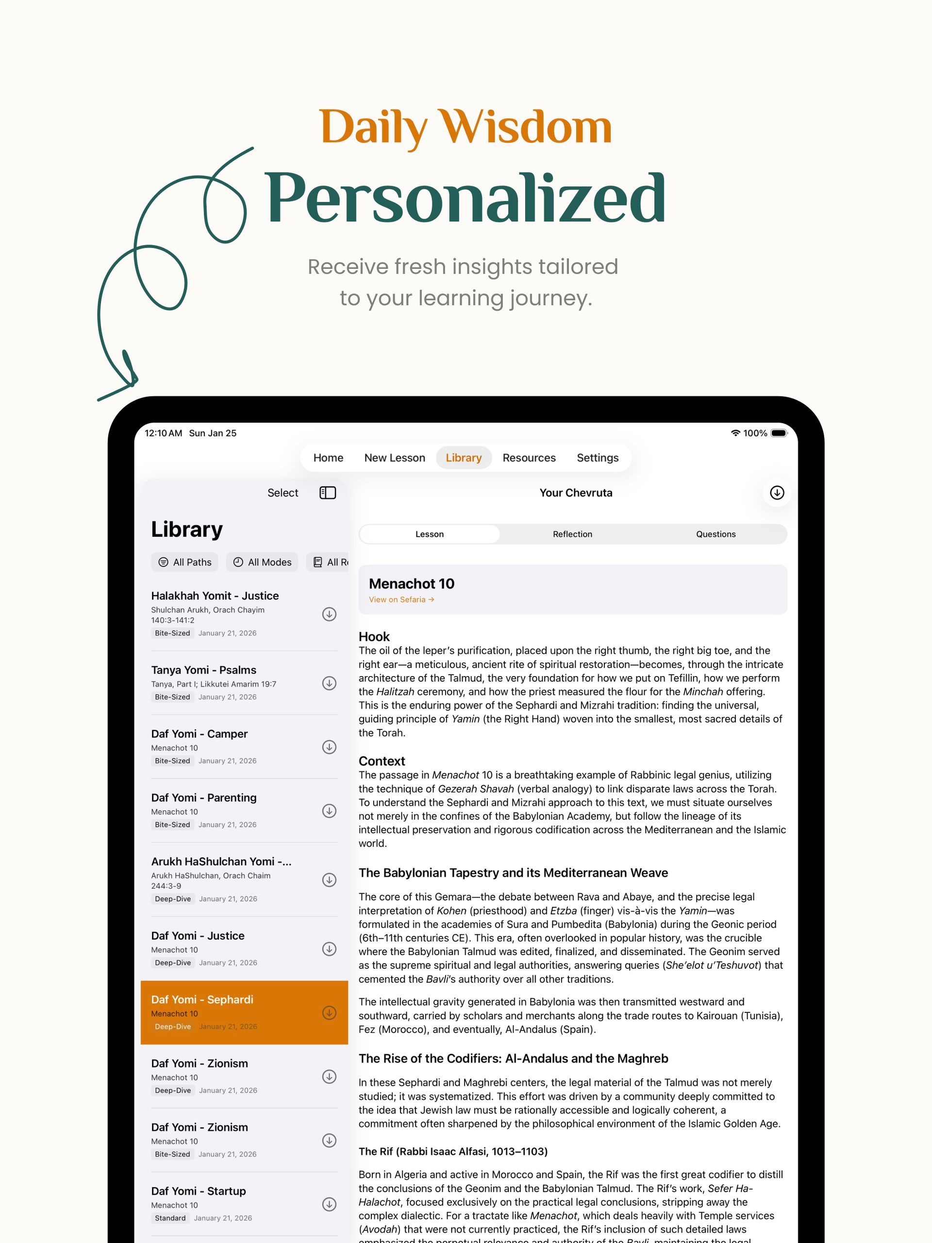
After months of building, I'm launching Derekh Learning—an iOS app that brings Torah, Talmud, and Jewish wisdom into modern life through AI. Here's why I built it and what it means.

Discover why 75% of website work is actually customer psychology, not design. Learn how emotional intelligence transforms digital projects and why the real product isn't templates—it's confidence.
How I built a thriving website division from scratch after being told it would fail. The complete story of turning skepticism into a 1,000+ site success with strategic thinking, smart processes, and a little chutzpah.
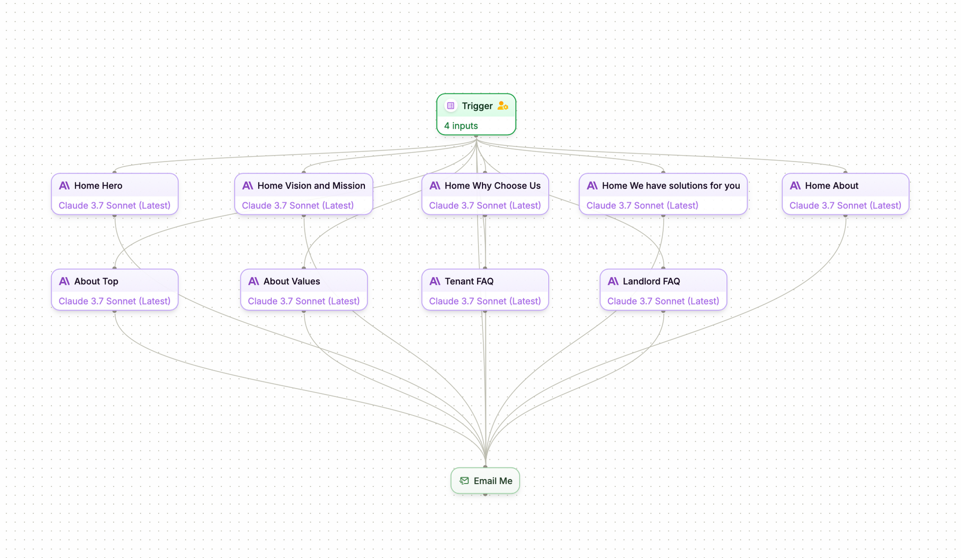
Discover how I automated entire Duda website content builds using Plumb AI workflows and ChatGPT prompts. Save hours while delivering custom property management copy that converts better than generic templates.

Discover why authentic personal branding beats AI-generated content every time. Learn the 70/30 rule for using AI tools while keeping your unique voice and personality that connects with your audience.
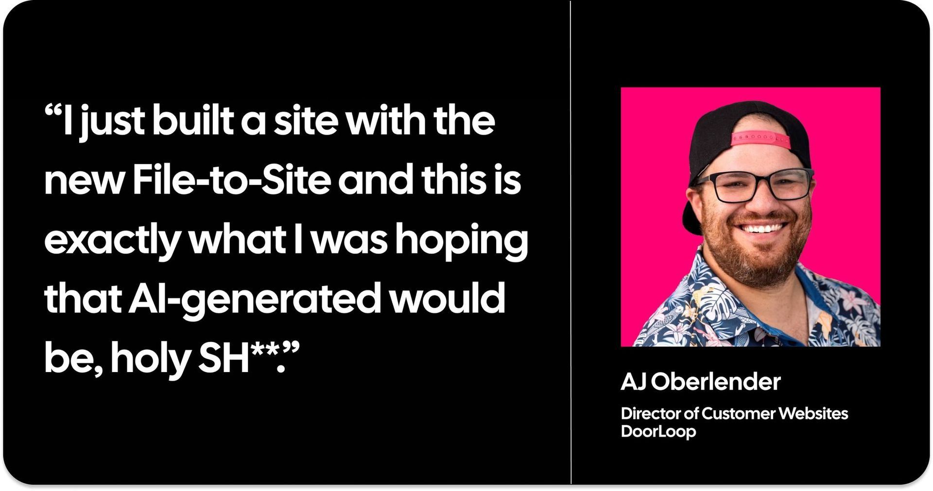
A web designer's honest experiment with AI website builders. Discover what AI gets right, where it fails spectacularly, and why human creativity still matters in web design. Plus, why the "human in the loop" approach might be the future.

Discover how hospitality-inspired employee treatment delivers 300% ROI and 40% less turnover. From Ritz-Carlton secrets to Southwest Airlines success, learn the VIP strategies transforming workplace culture and employee engagement.
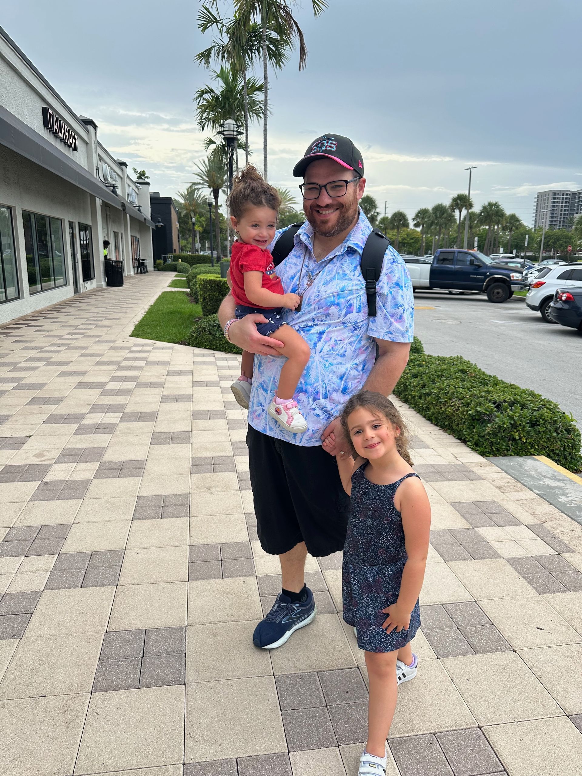
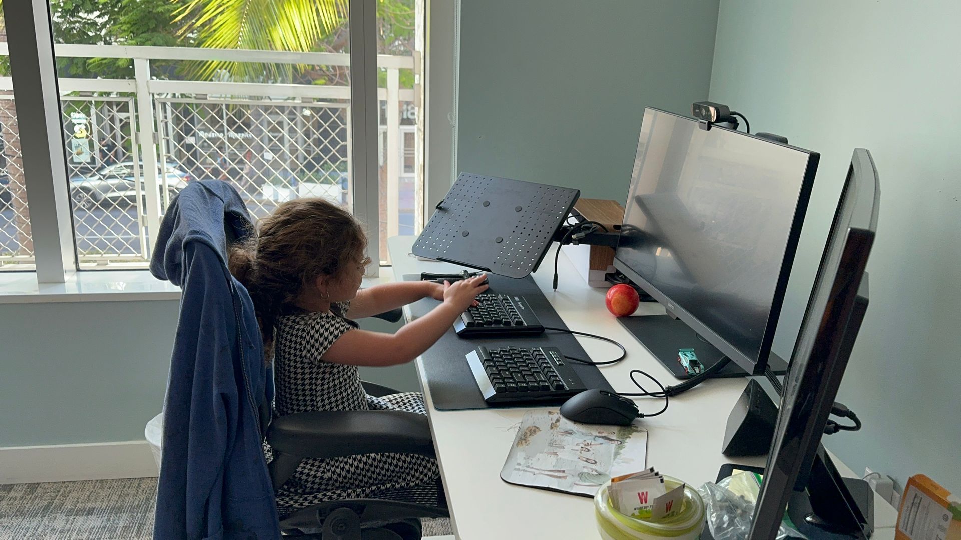
Raising bold, compassionate, and fearless kids in today's world. A personal reflection on teaching my daughters the true meaning of chutzpah - not just being pushy, but having the audacity to care and the courage to make things better.

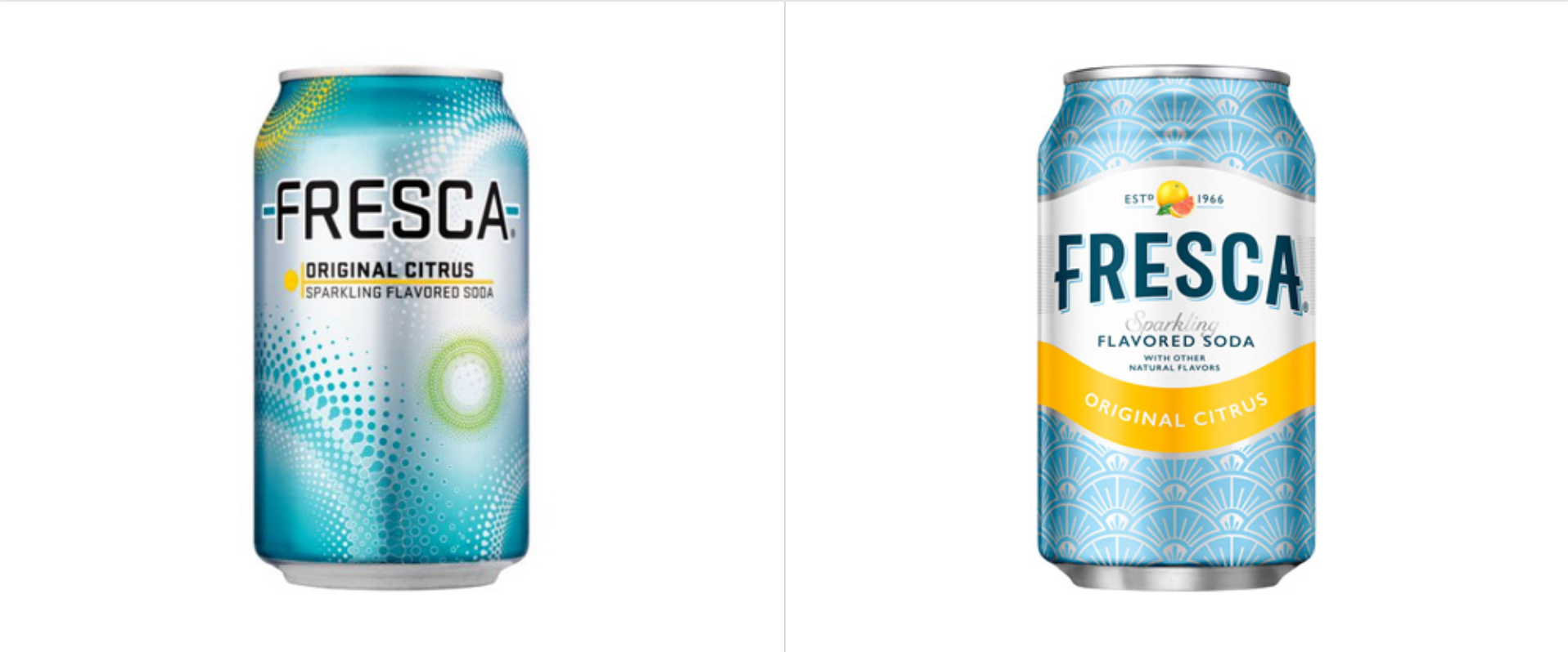
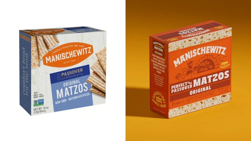
Discover why sports fans spend 306% more than regular customers and how businesses like Apple, Netflix, and Patagonia are creating fanatic-level brand loyalty. Learn the psychology and strategies behind building devoted brand communities.